
Best Interior Paint Colors for 2025 Trends
Discover the best interior paint colors for 2025, featuring expert-recommended shades and the latest trends to elevate your home's ambiance and style. Transform your space with the perfect hues!
BLOG
1. Chantilly Lace
Emotion: Fresh and clean, as in newly washed linen.
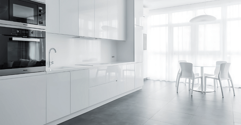
Details: This pristine white is an all-time favorite that never loses favor and conveys a sense of openness and light. It's perfect for small rooms that need brightness, like hallways or kitchens.
Example Use: Combine it with organic wooden furniture and greens for a Scandi feel.
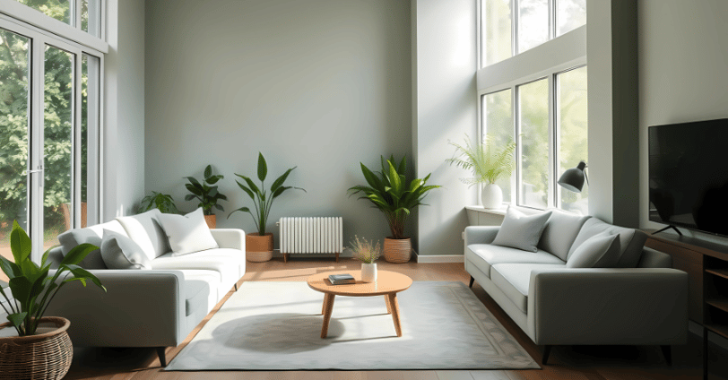
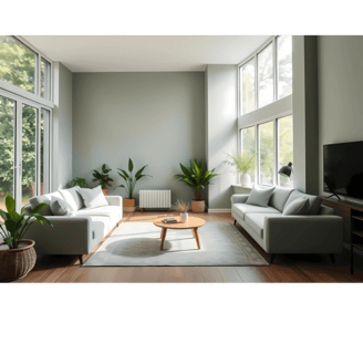
2. Repose Gray
Emotion: Soothing, balanced, and refined.
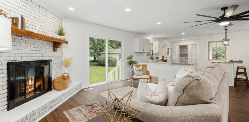
Details: Soft warm gray that will complement any lighting situation. It introduces a smooth depth of color without overpowering the space, so it is good for living rooms or offices.
Example Use: Pair with white trim and navy blue accents for a calm, modern look.
3. Accessible Beige
Emotion: Warm and welcoming, like a hug.
Details: Soft, pale beige with subtle gray undertones that can work in nearly any room. It's particularly wonderful in rooms where you'd want to feel rooted.
Example Use: Use it with dark wood furniture and light materials such as wool or linen for transitional style.
4. Simply White


Emotion: Happy and sunny, feeling optimistic.
Details: A warm yellow-white that is welcoming but not abrasive. It's perfect for an intimate bathroom or bedroom.
Example Use: Pair with gold hardware and pale pastel molding for the luxurious but minimalist look.
5. Hale Navy
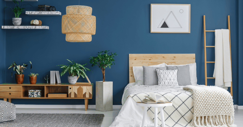
Emotion: Daring, assertive, and old-fashioned.
Details: A deep, dark blue that is dramatic and sophisticated. The color is perfect as an accent wall or applied to cabinetry in the bath and kitchen.
Example Use: Combine with white subway tiles and brass hardware for a nautical-inspired room.
6. Sea Salt
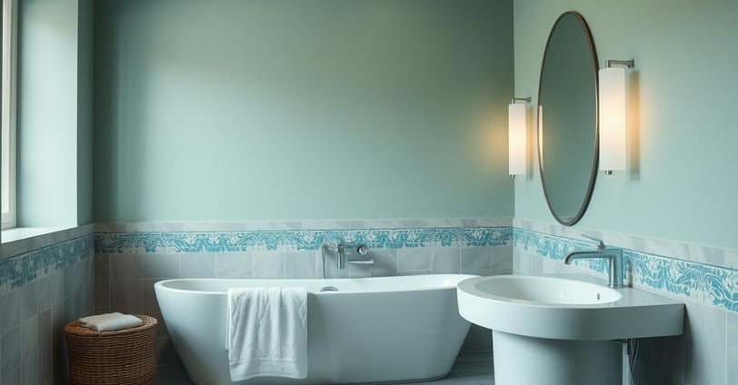
Emotion: Soothing and rejuvenating, like a crisp sea breeze.
Details: Pale green-gray blue undertones that evoke the feeling of a spa, ideal for bedrooms or bathrooms.
Example Use: Combine it with white trim and natural textures such as wicker or jute for a beachy ambiance.
7. Alabaster
Emotion: Cozy and welcoming, like a crackling fire.
Details: A warm, inviting white with a deep creaminess. It's ideal for dining rooms or living rooms where you want to foster gathering and relaxation.
Example Use: Pair it with metallics such as warm copper or bronze for a stylish, cozy effect.
8. Pale Oak
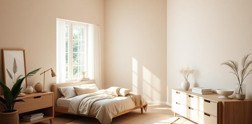
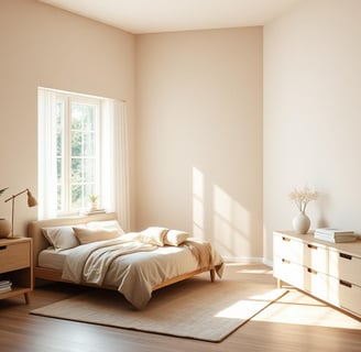
Emotion: Soft and serene, as on a misty morning.
Details: A pale greige (gray-beige) that adds a hint of sophisticated refinement to the space. It's especially well-suited for bedrooms or entryways.
Example Use: Combine it with pale blue or lavender for a calming color combination.
9. Gray Owl
Emotion: Crisp and clean, like a lung full of fresh cool air.
Details: A pale, green-tinted light gray that's great to utilize to create a light, airy feel in an area.
Example Use: Use it on kitchens featuring stainless steel appliances and white cabinets for an elegant, streamlined appearance.
10. Tricorn Black
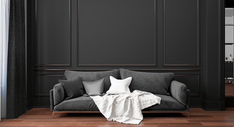
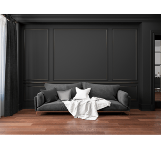
Emotion: Strong, elegant, provocative.
Details: Rich, bold black that brings drama and depth to any room. Though it may be daunting, it is ideal for accent walls, doors, or even ceilings in small quantities.
Example Use: Combine it with gold accents and velvet upholstery for a dramatic effect.